Datei:Economics Gini coefficient2.svg

Größe der PNG-Vorschau dieser SVG-Datei: 500 × 500 Pixel. Weitere Auflösungen: 240 × 240 Pixel | 480 × 480 Pixel | 768 × 768 Pixel | 1.024 × 1.024 Pixel | 2.048 × 2.048 Pixel.
Originaldatei (SVG-Datei, Basisgröße: 500 × 500 Pixel, Dateigröße: 2 KB)
Beschreibung
| Beschreibung |
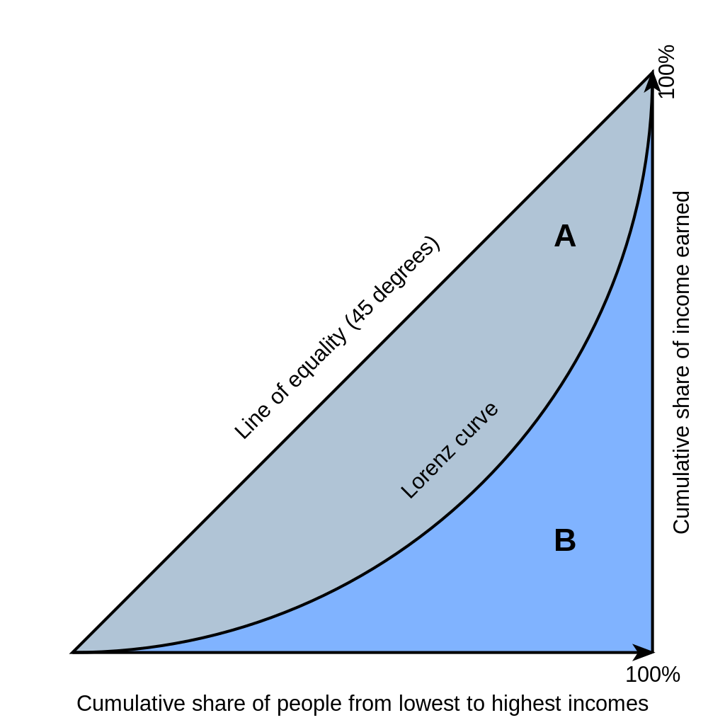
English: Gini coefficient diagram, based on the version by Bluemoose/BenFrantzDale. You can think of the horizontal axis as percent of people and the vertical axis as the percent of income those people receive. Therefore the Lorenz curves always start and end at the same places, where 0% of people make 0% of the country's income and 100% of people make 100% of the total income.
Inequality is implied when the curve is below the 45-degree line: At the left, the percentage of people is higher than the percent of income they receive (i.e. 10% of the people getting 5% of the total income); at the right, the percent of income received rises more than the percent of people receiving it. The area above the Lorenz curve -- marked "A" -- is shaded differently from the area below the curve -- marked "B". This simplifies the mathematical explanation of the gini coefficient, which is A/(A+B) |
| Datum | |
| Quelle | The original file was on WikiMedia Commons (http://en.wikipedia.org/wiki/File:Economics_Gini_coefficient.svg). I have edited the file. |
| Urheber | Reidpath |
| Andere Versionen | Abgeleitete Werke dieser Datei: Economics Gini coefficient2-ar.svg |
Lizenz
Dieses Bild mit Text besitzt keine Schöpfungshöhe und ist daher gemeinfrei, weil es ausschließlich Information darstellt, die Allgemeingut ist ohne ausreichende kreative Autorenschaft. Fakten, Daten und nicht originelle Information in herkömmlichem Schriftsatz oder einfacher Handschrift und einfache geometrische Formen sind nicht durch das Urheberrecht geschützt.
Hinweis: Dieser Lizenzbaustein ist nicht für Abbildungen von Prosa oder anderem kreativem Text gültig, wenn sie lang genug sind um urheberrechtlich geschützt zu sein.
|
Dateiversionen
Klicke auf einen Zeitpunkt, um diese Version zu laden.
| Version vom | Vorschaubild | Maße | Benutzer | Kommentar | |
|---|---|---|---|---|---|
| aktuell | 20:00, 6. Mär. 2021 | | 500 × 500 (2 KB) | wikimediacommons>Nyq | decapitalized common nouns |
Dateiverwendung
Die folgende Seite verwendet diese Datei: