Datei:Sauerstoffgehalt-1000mj2.png

Originaldatei (2.000 × 1.409 Pixel, Dateigröße: 74 KB, MIME-Typ: image/png)
| Beschreibung |
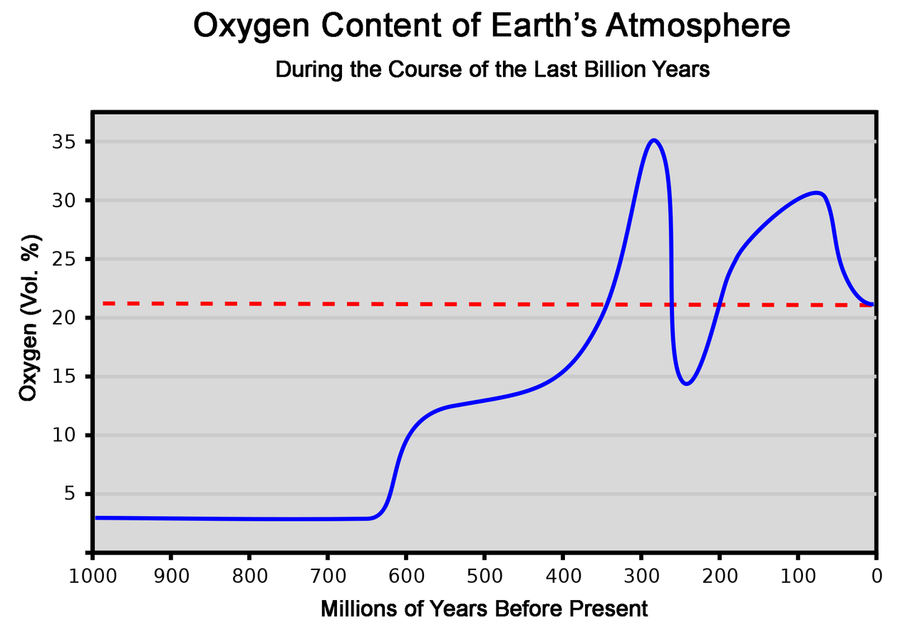
This graph represents the concentration of oxygen in the atmosphere over the last 1000 million years. As a reference, the dashed red line shows the present concentration of 21%. It should be noted that the O2 concentration variation which occurred in past periods can often be estimated only relatively coarsely. Therefore, the chart makes no claim to accuracy, but can only give a broad overview of change at the level of geological periods. This chart is based on the averaged data of several publications. [1][2] Explanation of the curve: After having already begun in the Precambrian, the outgassing of oxygen from the oceans caused atmospheric oxygen to jump from 3% to 12% around the beginning of the Cambrian, because by then all oxygen sinks were finally saturated. Around the same time, the Cambrian explosion took place. During the Silurian and Devonian plants spread over the land, while the animal kingdom was still almost exclusively confined to the water. This caused a further rapid and continuous increase of the oxygen concentration. In the following period carbon burial brought the oxygen level to 35%,[3] thus favoring overgrowth especially in insects. Amphibians and early reptiles were now present on land. Massive volcanic activity at the Permian-Triassic transition caused not only a decline of the oxygen content to 15%, but also the largest mass extinction in geological history. The oxygen concentration then recovered over a long period and reached 26% again by the middle of the Jurassic, and probably even rose to 30% in the Cretaceous. During this time the largest dinosaurs evolved. The end of the Cretaceous period is marked by an impact event, with climate change and a mass extinction. The oxygen level was only 23% 40 million years ago, and had reached the present value of 21% by 25 million years ago. Since then the level has remained constant, apart from fluctuations in the per thousand range. |
| Datum | (UTC) |
| Quelle | |
| Urheber |
|
| Andere Versionen | Abgeleitete Werke dieser Datei: OxygenLevel-1000ma.svg |
| Dieses Bild wurde digital nachbearbeitet. Folgende Änderungen wurden vorgenommen: Translated text to English. Das Originalbild kann hier eingesehen werden: Sauerstoffgehalt-1000mj.svg:
|
| Ich, der Urheberrechtsinhaber dieses Werkes, veröffentliche es als gemeinfrei. Dies gilt weltweit. In manchen Staaten könnte dies rechtlich nicht möglich sein. Sofern dies der Fall ist: Ich gewähre jedem das bedingungslose Recht, dieses Werk für jedweden Zweck zu nutzen, es sei denn, Bedingungen sind gesetzlich erforderlich. |
Ursprüngliches Datei-Logbuch
This image is a derivative work of the following images:
- File:Sauerstoffgehalt-1000mj.svg licensed with PD-self
- 2007-10-27T01:17:42Z LordToran 744x524 (41527 Bytes) '
- 2007-07-23T00:08:15Z LordToran 744x524 (42518 Bytes) == Beschreibung == {{Information |Description=Dieses Diagramm stellt die Sauerstoffkonzentration in der Erdatmosphäre im Lauf der letzten Jahrmilliarde dar. Es ist anzumerken, dass die Zeiträume, in denen vergangene Schwan
- 2007-07-17T23:57:50Z LordToran 744x524 (41203 Bytes) {{Information |Description=Dieses Diagramm stellt die Sauerstoffkonzentration in der Erdatmosphäre im Lauf der letzten Jahrmilliarde dar. |Source=Selbst erstellt |Date=2007-07-18 |Author=[http://de.wikipedia.org/wiki/Benutze
Hochgeladen mit derivativeFX
Dateiversionen
Klicke auf einen Zeitpunkt, um diese Version zu laden.
| Version vom | Vorschaubild | Maße | Benutzer | Kommentar | |
|---|---|---|---|---|---|
| aktuell | 12:31, 11. Mär. 2010 | | 2.000 × 1.409 (74 KB) | wikimediacommons>WolfmanSF | {{Information |Description=Dieses Diagramm stellt die Sauerstoffkonzentration in der Erdatmosphäre im Lauf der letzten Jahrmilliarde dar. Als Referenz zeigt die gestrichelte rote Linie die heutige Konzentration von 21% an. Es ist anzumerken, dass die Ze |
Dateiverwendung
Die folgenden 2 Seiten verwenden diese Datei: